PepsiCo: Doritos x PLC
January - March 2025
Adobe Illustrator, Adobe InDesign, Adobe Photoshop
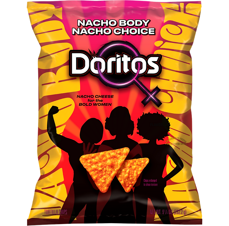
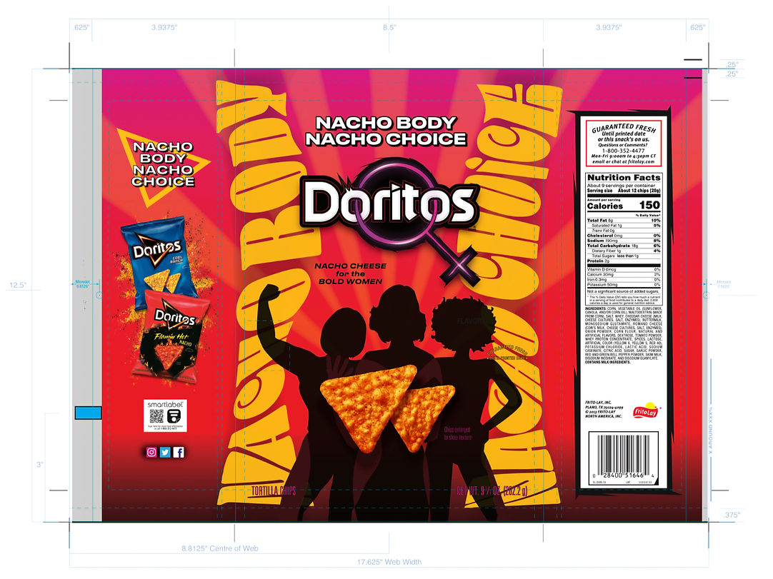
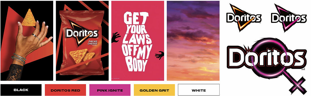
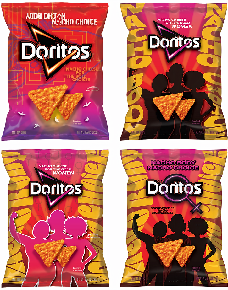
As part of a collaboration course between PepsiCo (Doritos) and Pensole Lewis College, I designed a bold, Gen Z–focused packaging concept for Doritos Nacho Cheese. Guided by four mentors from PepsiCo, I developed the project over several weeks, receiving ongoing feedback and industry insights. The final concept—“Nacho Body, Nacho Choice – For the Bold Women”—centered around themes of empowerment. A key focus of the project was striking the right balance between honoring practical brand guidelines and intentionally pushing the boundaries of the brief and being bold.
.png)
_edited.png)


A big part of this project was the process itself. My main takeaway is how much research, iteration and strategic thinking goes into work for a brand like Doritos. I gained a deeper understanding of consumer and brand research, gathering inspiration, studying competitors, and ideating. While the process may look sequential, it was far from linear. I consistently gathered feedback and learned from my four mentors at PepsiCo & two teachers at PLC, made revisions, with each stage informing and strengthening the others.
APPROACH
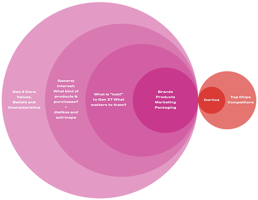
CONSUMER RESEARCH
My approach was to explore different parts of Gen Z’s lives—clothing, food, culture, and lifestyle—and extrapolate five core values: social justice, action, authenticity, humor, and collaboration. Three key inspirations shaped my design process. First, MSCHF’s Big Red Boots influenced me to design something bold with a shock factor. Second, since one of my main constraints was that I couldn’t change the bag’s material, I looked to the McDonald’s Halloween Pail for inspiration—solving for sustainability by creating a bag people would want to keep or display. Finally, Dove’s Campaign for Real Beauty inspired me with its authenticity and use of real people, a feeling I aimed to capture in my project as well.


BRAND & PRODUCT RESEARCH
I explored Doritos and PepsiCo as a whole to better understand their voice, values, and past successes. I studied existing campaigns and identified patterns in how the brand connects with Gen Z. From this, I highlighted three trends that often spark interest & engagement with Gen Z. My takeaways to include in my pack were good craftsmanship, novelty, playfulness, and making a strong first impression. This is what eventually led me to create my bold "Nacho Body Nacho Choice" statement and put it at the very top of the bag.


OPPORTUNITIES & INSPIRATION
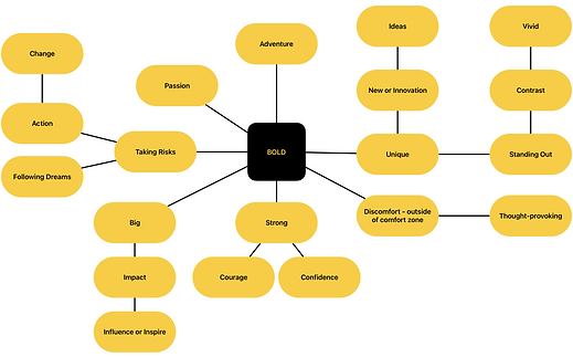
Throughout my process, I gathered inspiration in three categories: conceptual, visual, and packaging-specific. This structure helped me stay focused and intentional in my exploration. After completing my research, I distilled the insights into three key opportunities: connecting with Gen Z, give voice to an important issue, being cheeky or fun. I aimed to include all of these in my final pack design.


PROJECT STATEMENT
Design a bold Doritos package that celebrates strong, influential women and turns inspiration into action through a thought provoking, interactive experience.
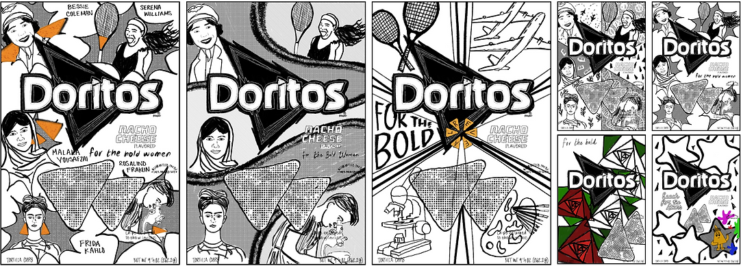
INNOVATION & IDEATION
Ideation began with simple black-and-white concept sketches, exploring a wide range of ideas, including optical illusions and peel back layers—to embrace a bold approach. As my project statement became clearer, I refined the direction with a defined color palette, required brand elements (logo and chip imagery), and typography experiments. To push the boundaries further, I reimagined the Doritos logo, inspired by Doritos Pride. I also printed prototypes to test how the design functioned in real-world context.
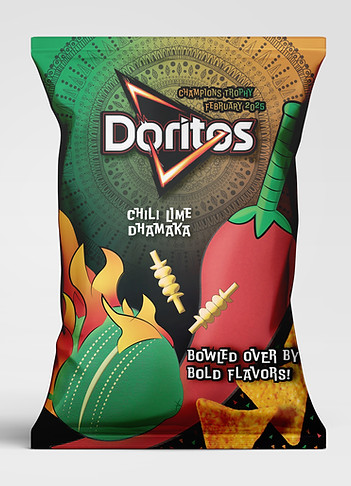
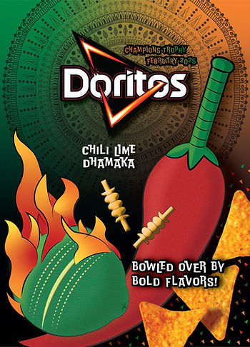
Created as part of my program application, this package celebrates my favorite flavor, Flaming Hot Limon, and my family’s tradition of sharing chips while watching cricket. Inspired by cricket-loving audiences in India, the design features a chili cricket bat, lime cricket ball, and a mandala backdrop. Bold orange and green hues, drawn from the Indian flag, highlight spice and lime while staying true to the brand. The word “Dhamaka”, meaning explosion, captures the flavor’s fiery essence and playful energy.